Role: Senior Brand Designer
Update
I have actually refreshed the Lingo Live brand since I added this to my portfolio. You can get a taste of it on the website here: LingoLive.com. I’ll include this project as a new addition to my portfolio soon.
The Challenge
After years as a scrappy startup, the team at communication coaching provider Lingo Live wanted to professionalize their brand to show the major tech company clients they were going after that they could be trusted to achieve results for their teams.
*Note: I did not redesign the logo.
The Solution
When updating the brand, I wanted to continue to express company’s upbeat approach to learning while adding with a touch of sophistication.
Website
I created a modular design so that Lingo Live team members can easily modify pages and create new ones, and used updated photography to convey the product’s key selling points: high-touch one-on-one relationships and an inclusive approach to career development.
Typography
To give the brand a bit of traditional, academic gravitas, I used Tiempos Text Semibold headlines. I paired them with Aperçu body copy to counterbalance the headline weight with crisp, airy elegance.
Color Palette
I balanced restrained rich green headlines and grey body copy with vibrant mint, aqua and pink background color options to make calls to action and key information pop—and for a splash of fun.
Photography
I developed a stock photo library of lifestyle images with subjects that represent the company’s diverse learner base and minimal backgrounds that could to apply to a range of workplaces.
Illustrations & Iconography
I developed icons and illustrations that had a bit of a hand drawn feel to emphasize the human, personal nature of the brand, and kept them simple and crisp for easy legibility at smaller sizes.
Marketing Collateral
I designed print and web versions of one-sheets, white papers and research studies to help the Lingo Live team communicate their offering and establish themselves as thought leaders in the communication coaching space.
Sales Decks
I created Google Slides decks for the sales and customer success teams to use in their presentations with prospects and customers. All the text is editable so the team could easily update them and reconfigure existing slides as templates for new materials.
UX & Product
During the website design process, I conducted client interviews to better understand our users’ needs from the site and to collect feedback on my designs. I am currently working on a new customer dashboard. For this project, I have interviewed and conducted usability tests of the prototype. If you’re interested in learning more about my UX work, contact me.
Role: Visual Designer
The Challenge
Guardian Insurance publishes an internal annual report to keep employees up-to-date on new company practices that affect them, like LGBTQ, diversity, and work-from-home policies and new charitable initiatives. They wanted to update the old look with something that was more clean, fresh and modern, but still consistent with their brand guidelines.
The Solution
I used Guardian's brand typefaces (Brandon and Arial), and a combination of their company photography and stock to create a dramatically new look for their report. By simplifying the page layouts, enlarging the images, streamlining the copy and magnifying the difference in type sizes, I was able to reduce visual clutter and create a more defined hierarchy so that readers could digest the information more easily – and enjoy the process of reading it.
When the project was over, the client emailed me to say, "We just launched the magazine today to great fanfare! In fact, one internal client wants to work with YOU on a future project. She LOVED your design."
Role: Visual Designer
The Problem
Jewish charity UJA-Federation was about to launch a new volunteer platform called Time for Good and they needed an advertising campaign that would re-energize their existing donors and inspire a new generation of young, New York Jews to volunteer and donate.
The Solution
The creative team and I tapped into the zeitgeist of New York Jewish values and culture inspired by the energy of the brand's logo – an eternal flame – to create a campaign which paired quippy, sassy copy, with bold, graphic imagery to spark laughter and compassion and ultimately drive volunteer sign-ups.
I specifically worked on the color palette, composition, photography treatment and stock sourcing for the ads and I collaborated with the copywriting team to create campaign guidelines to help UJA-Federation and its partners to roll out ads of their own.
Role: Visual Designer
The Challenge
SLS Beverly Hills is a luxurious Los Angeles hotel which caters to creative professionals. They wanted to refresh their business-like sales brochure to make it feel more glamorous.
The Solution
I worked closely with my Creative Director to introduce big images, oversized titles, and cut-off page numbers to make the brochure feel less transactional, more editorial.
Role: Print Designer
The Challenge
The Redbury Hollywood & Vine hotel often rents space to production crews for film and photo shoots and they wanted grow this share of their business.
The Solution
I designed a mix-and-match brochure which highlights their spaces and film-friendly services in the brand’s warm, nostalgic style.
The Response
"The Redbury team is LOVING their film sales kit… BIG WIN.”
– Jennifer Sorlie, Marketing Manager
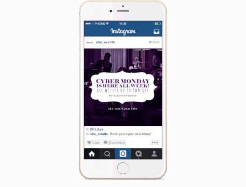
Role: Web Designer
The Challenge
The sbe Events & Catering division runs digital campaigns regularly to promote seasonal offers. They depend on these offers to generate a great deal of revenue, so the visual need to be irresistible.
The Solution
I created digital ads for the brand’s Cyber Monday, Summer Exclusive, and Wedding campaigns that draw viewers in with elegant typography and images that promise a glittering Vegas extravaganza, sun-soaked getaway, and picture-perfect wedding.
The Response
The sbe Cyber Monday campaign won a 2016 Interactive Media Award and produced $1,060,488 in revenue (9,680 room reservations).